
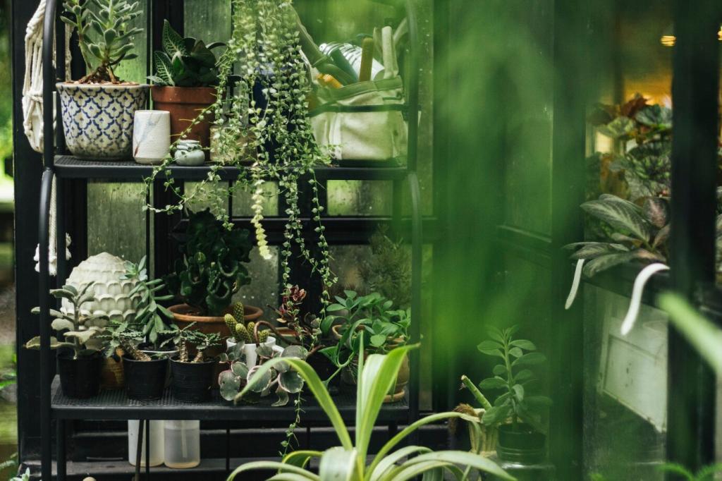

Micro-Nature: Moss, Lichen, and Fungi Color Worlds
A terrarium on my desk taught patience: chartreuse tips, bottle-green mounds, and smoky olive in the shadows. Pair with fog gray and parchment for a contemplative palette perfect for journaling products or reading nooks. What tiny greens live on your windowsill right now?
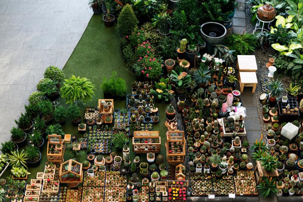
Micro-Nature: Moss, Lichen, and Fungi Color Worlds
Lichens paint rocks like antique maps—celadon islands, mustard inlets, dusty blue peninsulas. Translate this cartography into map-inspired palettes for data visualization or packaging. Use mustard sparingly as a landmark. Drop a photo of lichened stone, and we’ll send a three-color guide.